#it's been so long since I used that tag
Explore tagged Tumblr posts
Text

hellooo danandphilgames buddies!! happy belated 10 year (more like 5 but shhh) anniversary :-)
#dan and phil#daniel howell#phil lester#amazingphil#phanart#dnp art#IM SORRY IT TOOK ME SO LONG TO POST THIS HERE IVE BEEN MEANING 2 DO IT FOREVER#theres soooooo much i can say abt this piece... such a journey.... what a ride....#i gave this 2 them as a puzzle and had them sign a lil print of it and they were SOOOO SO SWEET WAHHH#i luv them sm.... im so grateful 4 their kind words it rly meant the world 2 me ;___;; <3333333#also dan was like “good luck to us doing that puzzle on the bus!” as i was walking away fkjhsdfhj#anyways anyways ok sry back 2 the pic!! theres SOOOO many parts thatd b fun 2 point out and explain but itd b too long for tags AAAAA#would any1 b interested if i made like... a thread on twt or smth mayhaps...? or reblog this with a read more underneath...?#ive only ever just posted art and dipped idk how non-tag yapping works despite me being on this site since i was like. 12 kdsjhfksdh#my art#if ur reading this hi ily i hope ur having a good day!! :-) <3
534 notes
·
View notes
Text
Different standards
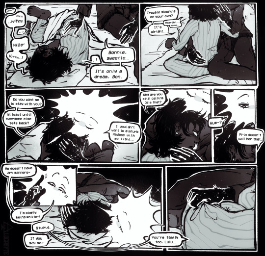
#didnt mean to do this one in quote unquote colour but it wasnt legible without it so. heres a treat i suppose#isat#isat spoilers#in stars and time#in stars and time fanart#isat fanart#isat loop#isat bonnie#lucabyteart#coughs up a lung. anyway. ramble time as per usual. this is what i was warming up for btw in case it wasnt obvious#besides being another entry in the 'letting bonnie read loop for filth on accident' series. this is mostly self indulgent musings on#headcanons (and i will just use that word here.) ive previously rambled about in other tags and posts#namely: in the scenario that loop integrates into the party as a New Person for quite a while before The Truth Come Out. i feel they have#a decent chance at really scoring a slam dunk in becoming a guardian figure for bonnie? loop's demeanor is already colder and a tiny#bit more level-headed than siffrin's in the way they seem to discuss bonnie with them. namely pointing out that bonnie#never really hated them. it seems to be one thing they're genuinely at peace with? they've seen by now the truth that bonnie#was just scared and upset. and likely now knows that what bonnie wants is to be treated with grown-up respect within reason. plus loop#already scores bonus points with bonnie since they didnt 1. fuck up bad like sif did in act 5 and 2. saved sif in the party's eyes#... but then when it turns out that this clean-slate relationship with a stranger was siffrin being deceitful? must have been odd.#bonnie seems to really dislike being lied to. the question is whether they'd see it that way? would they feel betrayed there?#anyway. this is set after all those emotions are at least settled some. loop able to be more physically affectionate... and yet#still not letting themselves be quite as close as they'd like perhaps. perhaps...#anyway translucent pyjamas because i dont care if you're comforting a crying child you've GOT to SERVE!!!#and also i feel like the party probably wouldn't let loop stay completely naked for that long. especially not post-reveal anyway
867 notes
·
View notes
Text
In a bout of insomnia, I popped open the AGDQ stream, and it started by serving up a Smuckers ad. I had about half a second of thinking, "Wait, that looks like Brandon Keener--"
And then he opened his mouth and, yeah, instant Garrus.
Sorry to typecast you forever as my alien boyfriend, good sir, but I will always look back fondly on that dance on our first date.
youtube
#accidental mass effect#page's alien boyfriends#it's been so long since i used that tag#it was a good tag okay#Youtube
1 note
·
View note
Text

the star you've longed for
#PLEASE WATCH REVUE STARLIGHT!!!!!!💥💥💥💥💥#project sekai#revue starlight#pjsk#emu otori#nene kusanagi#emunene#prsk#proseka#yuri win. i make my fav pairing fight tothe death#HAPPY EMUNENE WEEK LOOOOOL#Can i be hinestni think this sucks it took way too long cause i forgot how to draw for a week#im seeing demons and stuff. i feel more normal now. Also you may recall emu has a big hammer for revstar#thats the bottom of it the gem thing all the weapons have hers is sharp#i remember seeing meta post abt how mahiru has a blunt weapon because she never actually aimed for the lead role#rather she only wanted to be by karen's side. so her weapon wasnt capable of cutting anything in the first place#Fastforward to the movie and well LOLLLLL#though i think its funny in the movie her mace is still mostly used for i timidation againstbhikari.. bc again shes not winning for a lead#revue starlight youre neat. maybe i like revstar.#<- has been insane for 4+ years#Needed their pose to be smth where nenes weapon isnt visible because I DONT KNOW WHAT WEAPON TO GIVE HER. OOMFS HELP. I NEED A NENE WEAPON.#i thought some sort of polearm/spear/halberd etc something with range but that can be ambitious#but i feel like smth with that much footwork needed doesnt suit her.. And she cant hsve a sniper i dont think thatwould fucking work#aruru gets pistols in the revue but aruru also is Ummm well shes uhhh. [screaming] [car crash]#throwing knives would be funny wouldnt it. Put that gamer aim to use#idk if the emunene week tag is on here but i'll donit anyways#emuneneweek2024#EDIT: i have decided nene gets a rapier. its awesome. thanks for coming#tsukasa has his giant flag and i dont want to budge on that. im thinking about giving rui the throwing knives since he juggles.#it would be funny. saki + rui knife juggling
595 notes
·
View notes
Text
The Boy Wonder #1 by Juni Ba rambling about why every time i open this book, i stare in wonder...HAHA and ofc!! how cute Damian is!!
Juni Ba’s style is so absurdly effective in telling a fairy tale for the ages. It’s a stunning blend of simplicity and complexity I'M GRIPPING THE PAGES AGAINST MY EYES…
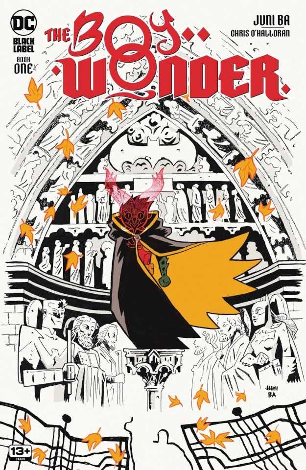
Before getting into the interiors, THE COVER!! It associates autumn leaves to Damian's Robin title through the iconic cape shape/color; and on top of that, for a Robin going through a big transition in his life...a season of change one might say...Juni Ba your brain...
Damian and the leaves being the only colored parts of this cover is nice in focusing on those elements, but i also like to think by not coloring the background it prepares you to expect impressive inkwork in this book.
On that note, the interiors!! Starting off with Ba's backgrounds of Gotham as it establishes the strange new world that our young hero has been thrust into:
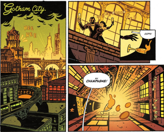
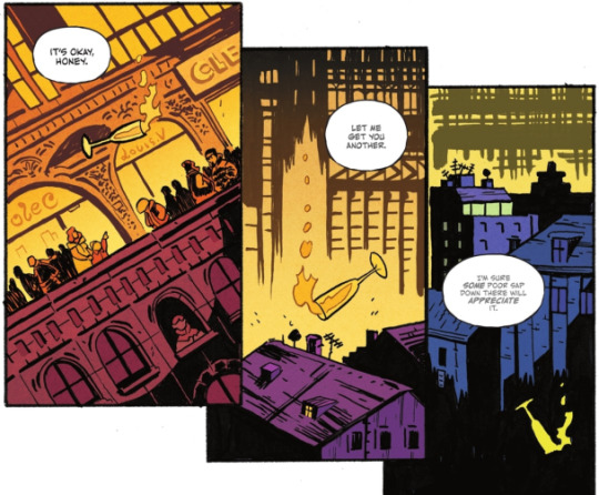
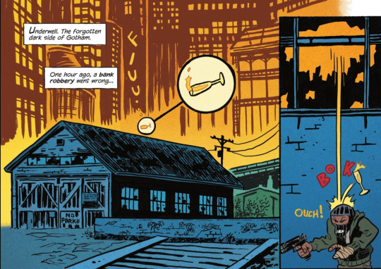
We get a neat tracking shot following a champagne glass that gives us a glimpse of Gotham from the upper echelons to the downtrodden in "Underwell"
This opening sequence quickly lays out the environment Damian will be traveling through in this series! It also sets the tone for some silliness with the cute zoom on the champagne glass before it BOKs the robber lol. Along with Ba's inks, O'Halloran's colors makes every part of Gotham pop - especially love the golds of the higher society shifting into the blues of the underbelly!!
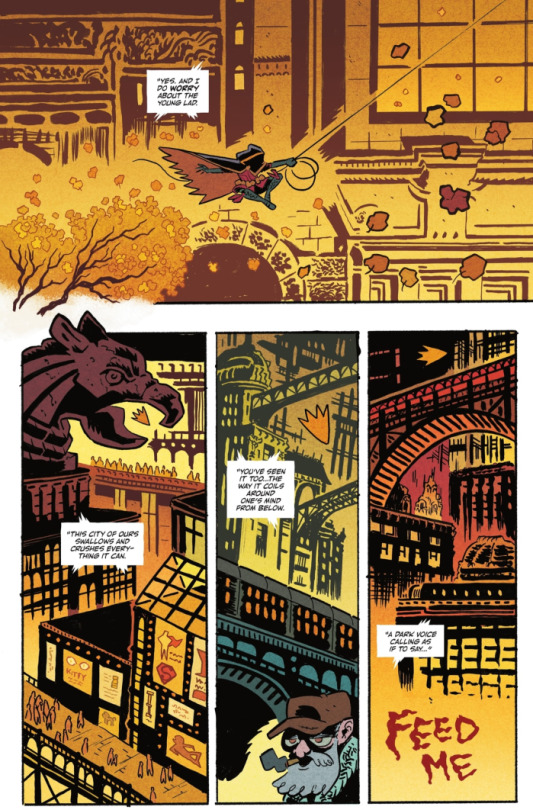
Besides Damian’s personal conflict, Gotham feels like its own entity that he has to contend with. The dialogue speaks for itself, but within the art as well!!
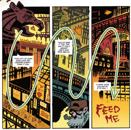
"This city of ours swallows and crushes everything it can" -> a gargoyle's beak over Damian, crowds of people, and walls of advertising
"You've seen it too...the way it coils around one's mind from below." -> bridges and a passing train on a rail viaduct towering over a civilian
"A dark voice calling as if to say..." -> literally, "FEED ME"
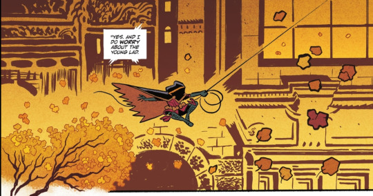
LOVELY SHOT OF MOVEMENT... and i love how Damian's venture into Gotham opens with him passing a tree - its branches and leaves are the most organic element on the page before getting into the gritty details of the city! Some yammering because the inks are. so cool: the delicate lines of the leaves in the tree to the thicker/bigger lined ones closer to the camera on the right; the background inks allowing space around Damian's form + the fine line of his grapple!! More O'Halloran praise - PRETTY, and love his coloring over Ba's bg lines, particularly here, keeping the leaves darker on the right.
It's not only a pretty page it's just a really clean layout!! Ba exhibits this throughout the book but i really enjoy it here - from Damian nyooming, we head into these last 3 panels. his cute lil "Robin" shape easily draws the eye to the tops of the panels as we take in Gotham's liveliness alongside the lettering/narration
and the "Robin" shape?? SO CUTE. it's instantly familiar to us as Robin!! bold outline and filled with yellow...it's a Robin in movement!!...AN AUTUMN LEAF IN THE WIND... yeah, still not over that 😭
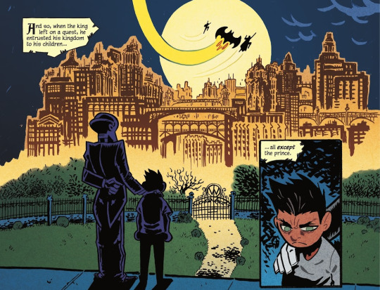
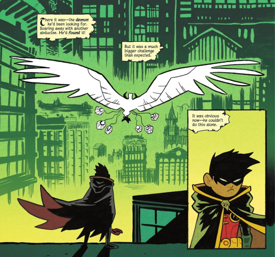
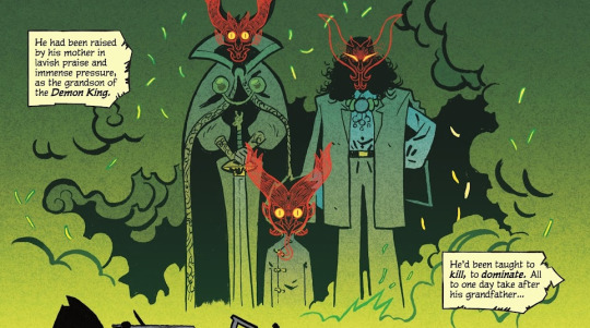
Damian's inciting incident is introduced in the former panel with a gorgeous backdrop of Gotham in the distance (plus itty bitty Trinity cameo haha). The shot parallels!! beautifully!! in the final page!! Damian is now in the depths of Gotham, his objective out of reach. The colors are of note too, where the familiar yellows of Gotham are suddenly a startling green after the demon makes its appearance. The Gotham land looks even more unfamiliar, which prompts Damian to seek help.
Some speculation, but the green could also be associated with the more mythical side of demons and such (like the ghost?? of the thief), but it could even imply there's a connection to the Al Ghuls themselves as it's the only other time green is so prominently used.
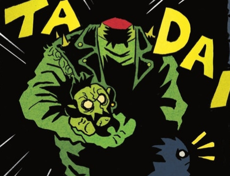
Now that the land of Gotham is established, popping in other fav bgs!
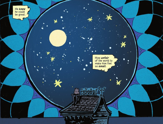
More lovely mix of Ba's inks and O'Halloran's colors!! especially allowing some of the brush/marker strokes to show faintly as part of the twinkling sky...STUNNING!! 😭 i love this whole page but this panel gets me weepy, SMALL DAMIAN IN THE VAST UNIVERSE COMBINED WITH THIS LINE "He knew he could be great. How unfair of the world to make him feel so small." KICKS MY ASS... i need to lie down
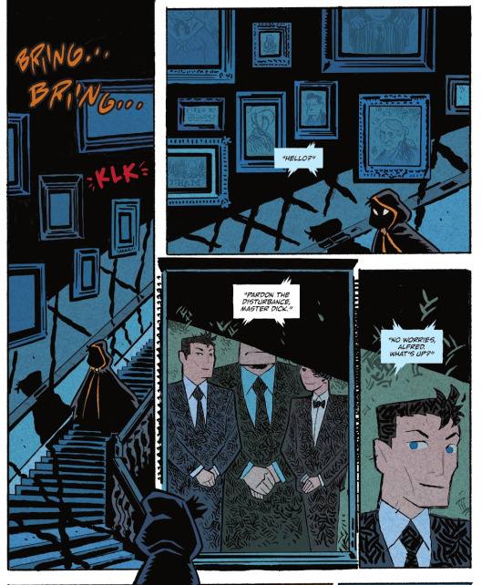
YAPPING AT MORE WONDERFUL INKING: the suggestion of windows offscreen from the frames casting these thick lines over the walls and stairwell; the minute shadow details over the railing; the hatching on the suits in the portrait; the framed portrait being its own panel!! cute hooded Damian in the gutter space looking in on the portrait/panel!! CUTE HOODED DAMIANS!!
SPEAKING OF PANELS, along with general effectiveness and efficiency, there's more whimsy in others!! like this kickass page of Nightwing whipping his escrima from first panel -> afterimage lines going POWPOWPOW hitting demons from a distance to ones closer to the camera -> and back into his hand!! IT'S SO GOOD AND SO FUN!!
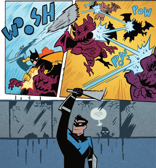
Ba's action employs more diagonal panels, and characters are less restrained within boxes - there's more energy and freedom across the page!
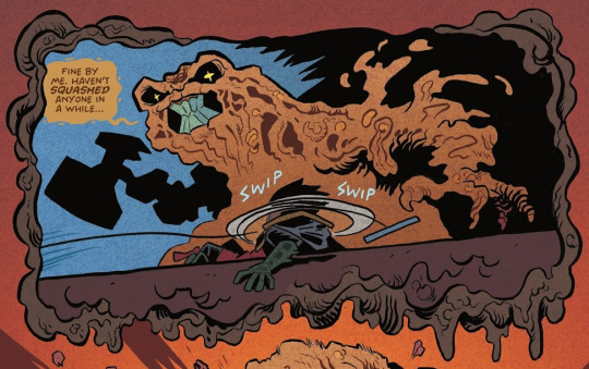
not necessarily focusing on the action for this one, but THE WHIMSY!! the border itself is goop!! Also gotta point out that looming hammer shape!!
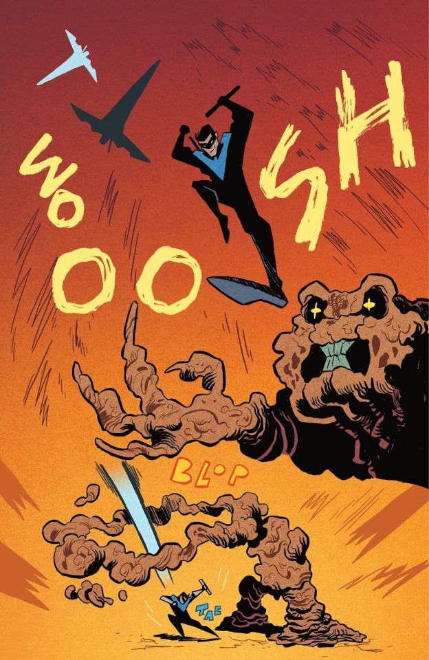
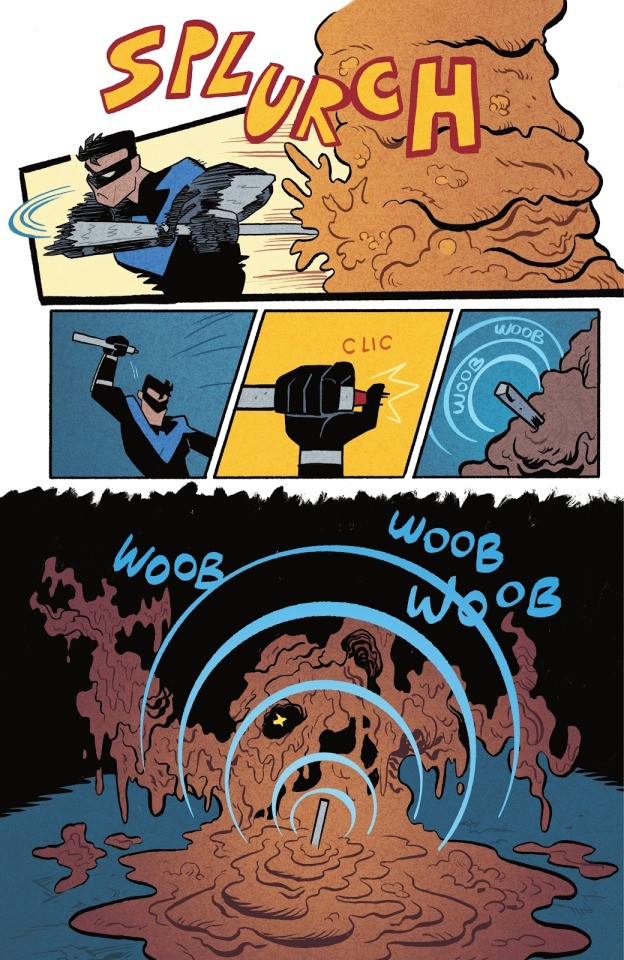
Nightwing's critical hit spans the entire page!! from silhouettes of a flip -> flashy stomping pose/Clayface -> to a distant shot of Dick landing
and a smooth finisher page!! love the motion lines on Dick's arms and waist + his head and arc effects popping outside of the borders; then the smaller panels for quick activity, and the final WOOB WOOB WOOB LOL i can hear this sound effect just as much as i can see it
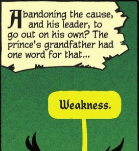
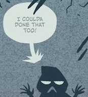
Along with O'Halloran on colors, Aditya Bidikar on lettering works seamlessly with Ba's vision!! The text boxes for the fairy tale narration are like strips of yellowing pages from an old storybook!! Had to look up the term for this lol, but also reminiscent of those storybooks, there's even a use of "drop caps" - the big fancy capital letter!
Smaller things of note, but the bit of "Weakness" text from Ra's has a kind of. grandiose feel to it. Then the cute B< Damian behind the window!! Love how the bubble and text are faded behind the glass too! The end of the bubble tail is a nice touch as it matches well with Ba's bg inking :0
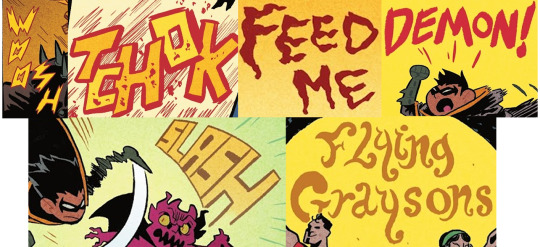
Otherwise, it seems Ba has done a majority of the lettering - dropping a couple of my favs below!!
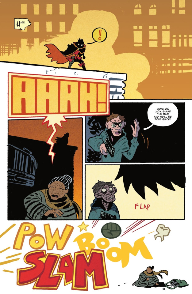
also just this whole page: the very loud AAAH! text draws both Damian's and the reader's attention to the panel below!! it's a cool transition to a new shot where you can see Damian's silhouette on the building! The final panel is cartoony violence off-page through the bold POW BOOM SLAM haha + DAMIAN'S LIL FIST!!🥺 and the guy's tooth RIP
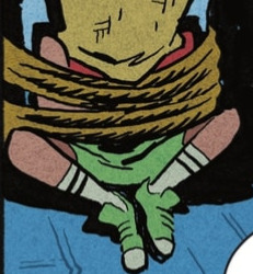
Pure speculation - Juni Ba's concept art included Carrie Kelley, so i'm wondering if the hostage in the beginning could be her and we'll be returning to this moment in time by the end. The worn Robin colors are similar to the design + their head is conveniently covered.
In terms of story, I'm obviously heavily biased, but the initial read got me rolling in emotions with how it has you caring for Damian. Damian as a character is so fantastical in essence - it’s part of his individual charm in the batfam cast! an heir of two kingdoms, born and raised with great expectations suddenly thrust into an unfamiliar land. he has a sword. he has a dragon bat for a companion. he is haunted by the sins he has committed. he is two apples tall. he's truly fairytale material!!
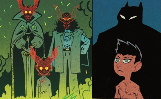
LIKE...past the panels of only his silhouettes, this is our introductory appearances of Damian. It's laid out clearly in the narration, but this parallel is SO GOOD: from the powerful and ornate visuals of Damian and the Al Ghuls -> to a simple panel of Batman's shadow behind a boy littered in scars, stripped of his home and status
Damian is out of his element and proves himself in the way he knows how!!
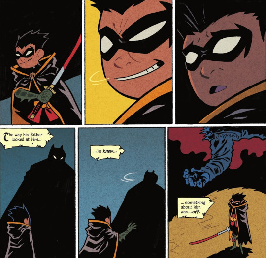
just kick me down a flight of stairs why don't you. i don't know which messes me up more, the top 3 or bottom 3 panels. His facial expressions!! his expectations for approval dashed!! Damian's hand reaching for his father!! only to be left alone with the body. The page after this is the final nail in the coffin in feeling just how lost he is in the world before he acts on it. And you root for him the entire way!!😭
Despite Damian's fanciful background there's so much heart to be shown in his struggles and discoveries - and this classic form of a fairy tale lays it out so brilliantly!! It's shaping up to be an amazing balance of heavier elements and whimsy based on this first issue, and it leaves you wanting more!!
Besides being a thoroughly enjoyable read, it's inspiring work!! i've ordered Juni Ba's other books to consume more of his storytelling, and here's the ones i've found so far if you're interested in checking them out as well!!
Mobilis: My Life with Captain Nemo
Monkey Meat
Djeliya: A West African Fantasy Epic
The Unlikely Story of Felix and Macabber
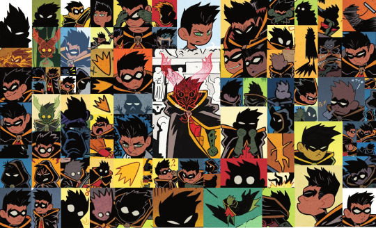
okay shockingly, i didn't blab about how cute Damian is as much as i thought i would, but i think the collage at the top speaks for itself lol
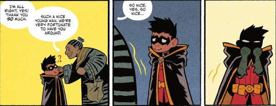
this is all you need to know how cute Damian is in this!! his cheeks are so pinchable, it was done on page!! 🥺 these panels obliterate me
#rambling#damian wayne#it's been 2 weeks since this issue came out and i'm still cracking it open every other day#throwing my chattering into his tag to possibly get more people into the series especially if you're a fan of Damian!!#i even used capitalization for slightly easier reading LOLL#the Damian collage was taking so long i was laughing how i'm taking more time to do that than the actual ramble#then i started rambling and then i realized i couldn't shut up sdfgh#feel like i sound delusional most of the time so these are maybe my most coherent thoughts LOL#pointing at pages over my brother's shoulder 'love that...so cool...look how pretty that is...' articulating WHY makes me sound insane😭#the boy wonder
650 notes
·
View notes
Text
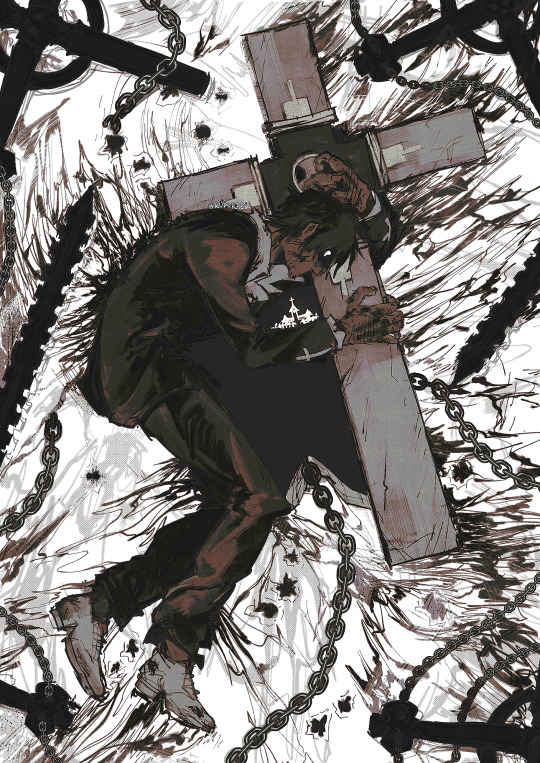
all I wanted was to save them... (ID in alt)
#nicholas d wolfwood#trigun#trigun maximum#tw blood#let me know if there's any other tags i need to use!!! not sure if it counts as gore#ruporas art#*vash voice* YOU ARE NOT WRONG/LOST WOLFWOOD!!!!!!#i think very often about ch 49 where wolfwood thought it was fr over for him for that brief moment. he was already bearing with so much#fatigue that it wasn't going to be enough for him to fight back properly.. and ough... augh..... for the first time after bearing that cros#someone saved him. someone saved himmmm AUGHHHH <-- guy who can't be normal about it even though its been 7 months since i read it#but he's suffered alone for so long and continued to do so because it's all he ever knew in those short years#and its devastating. his one and only desire was simple and it was still difficult for him to reach T_T#anyway... i love him... holds him tenderly in my palms
2K notes
·
View notes
Text
CW FLASHING IN THE VIDEO (3rd from the bottom)
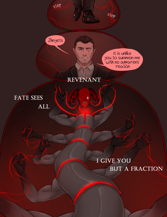

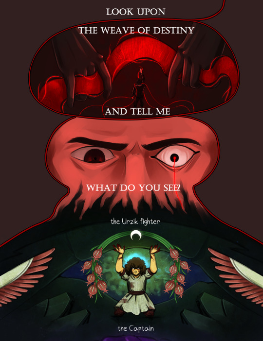
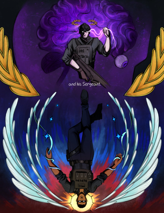


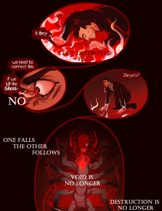

This is it. 3 months in the works, the comic (and video) are finally done.
A little over a year ago, I uploaded the first work in Revenant AU, Ghost's origin comic. I never thought I'd write a whole series for this, but I'm so glad I did. I got a whole new hobby out of it, haha.
I already began working on part 2, but this for me marks the start of it. I'm really excited to get back into this world!
Under the cut there are some comments on the comic I thought some people might be interested in (don't wanna make this post longer than it already is lol). I will upload the frames from the video separately, with comments on it there.
Bottom line is, thank you for letting me just go wild with this :)
Okay, I'm mostly gonna talk about the part where Fate shows Makarov the 141+Farah. Makarov doesn't see the Fate of people as literal images, he often has to interpret odd symbolism in the flashes he gets from the Weave of Fate.
I decided to go for a style I saw in a collection of calling cards in MW3, mainly from this one:

You can really see it in the faces and pitch-black cel shading.
I'll be going in order of appearance, starting with Farah.
Obviously, each of the "flashes" shows the Reaping of each person, Farah being crushed under rubble. Behind her is a helo of green gas, which symbolizes the Russian experimental gas. The motifs around her are more interesting imo - they're taken from the Urzik flag (and yeah apparently it's "Urzik" and not "Urzikstani"... according to the wiki at least). Wings, plants (feels to me like a pomegranate and some sort of crop, but I couldn't find what it is specifically), and a moon, upside down.
I'm skipping ahead a bit, but I've had the idea to make a drawing of Gaz in the Hanged Man pose since I started the AU basically. I tried sketching it once, and it went bad so I gave up lol. But I decided to come back to that here, and add some sort of tarot connection to all of them. I know practically nothing about tarot, googled the meanings of each, they fit well enough, I called it a day lol.
So Farah is the Moon, upside down.
Price is next, showing him taking control of the brain of someone. I didn't use the flag of the UK for the 141 (it'd be kinda boring...), instead I took the Taskforce 141 logo, and broke it down to different elements.

I took the laurels for Price, both framing his illustration and sitting above his head like a crown. I decided he will be the Emperor.
Next up is Gaz, the Hanged Man of course. Gaz gets both the wings and the stars (I changed mine to 4-pointed because... I like them better). Pretty clear why, both symbols relate to the sky. The illustrations kinda follow a rough day cycle, if that makes sense. Farah being night, with the moon. Price with his golden and purple color palette, twilight. Gaz being sunrise, and Ghost and Soap, day. This is why Gaz has a sun behind him.
Ghost was fun because he's the only inhuman one out of the group. I'll let you think what that implies, that even in Fate's Weave, Ghost is an outlier... Ghost gets the skull, and the card "Death". That one was easy, but what I did add is blood flowing down the skulls, like tear tracks...
Soap, the problem child, gave me the most issues as always. For once, it wasn't his fucking face, it was the flames behind him, and overall contrast and readability issues. Soap's illustration is probably packed with the most "hidden" details, though they're obvious if you've read the fic and Konchar's side story. The headless man behind Soap is Konchar himself, holding 4 chains with dog tags on them. The 4 soldiers from Soap's squad, who he killed before Soap was Reaped. Soap's pose is from the moment he came to his senses, after getting shot in the head and destroying a large part of Verdansk. He has 4 swords, pointing at him and downwards, so his card is 4 of Swords, upside down.
Between Soap and Ghost is a circle and a triangle. I'll explain that in the post concerning the video, since that's where I got that from.
If you read all of this, thank you so much! There will be another post for you to read in a moment lol
#cw flashing#call of duty modern warfare 2#cod mw2#cod ghost#cod soap#cod gaz#cod price#cod farah#revenant au#simon ghost riley#john soap mactavish#kyle gaz garrick#john price#farah karim#vladimir makarov#call of duty modern warfare#call of duty fanart#cod fanart#its been so long since i used the rev au tag...<3#as you can imagine... drawing a creature with literally 10 arms flailing around was quite painful#i think you can see me give up on the anatomy in real time there lol#but i do like how this turned out. the video couldve been better edited but#after effects crashed on me 4 times in the few hours i worked on it already so. fuck that lol.#also makarov isnt having a good time huh#deserved tbh
261 notes
·
View notes
Text
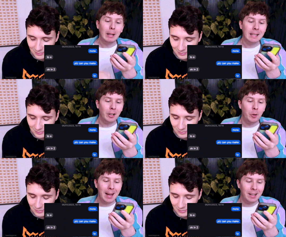
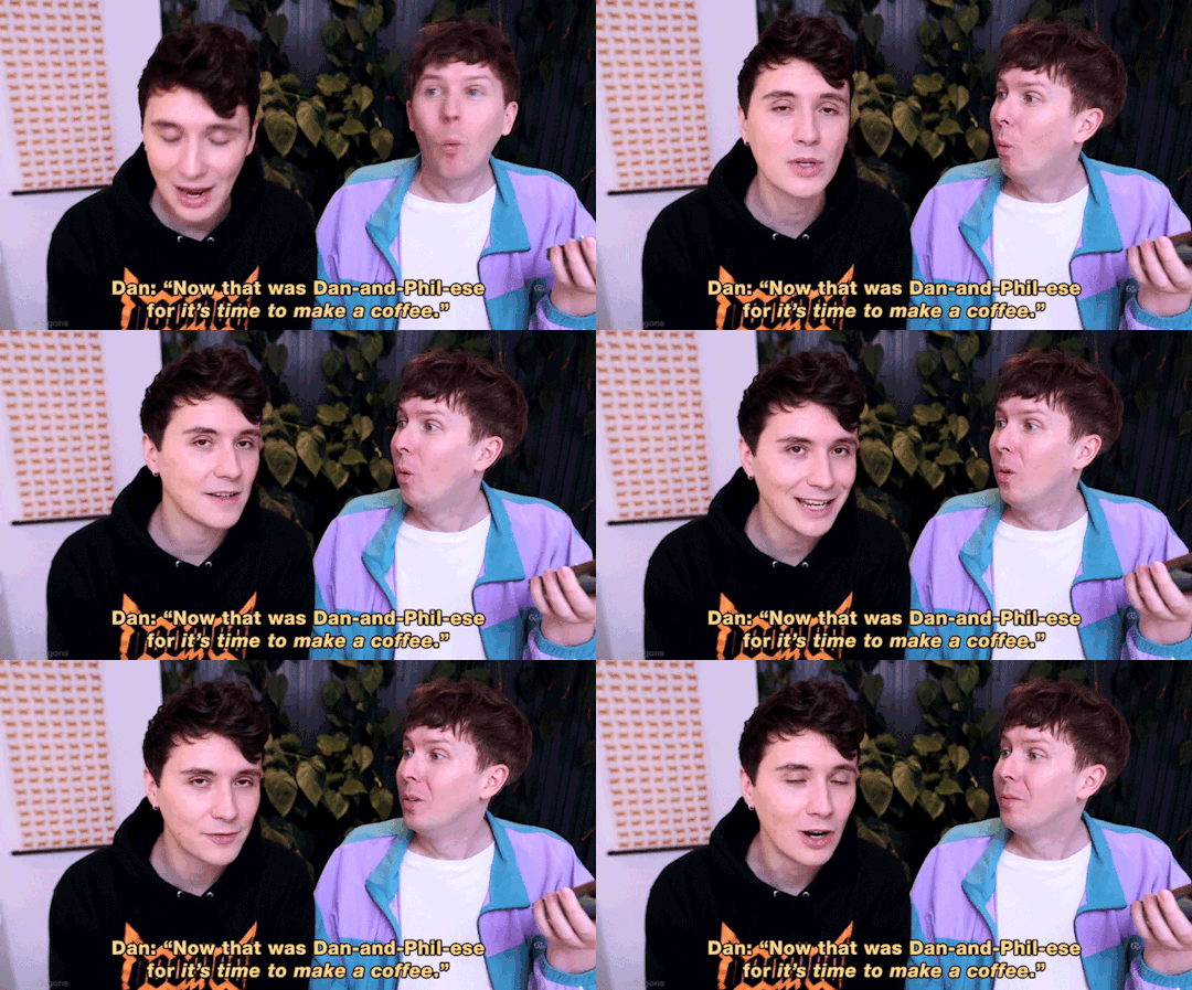

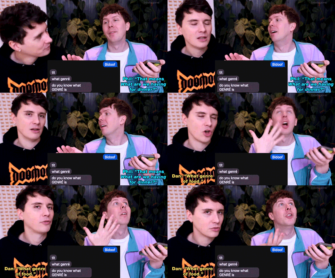

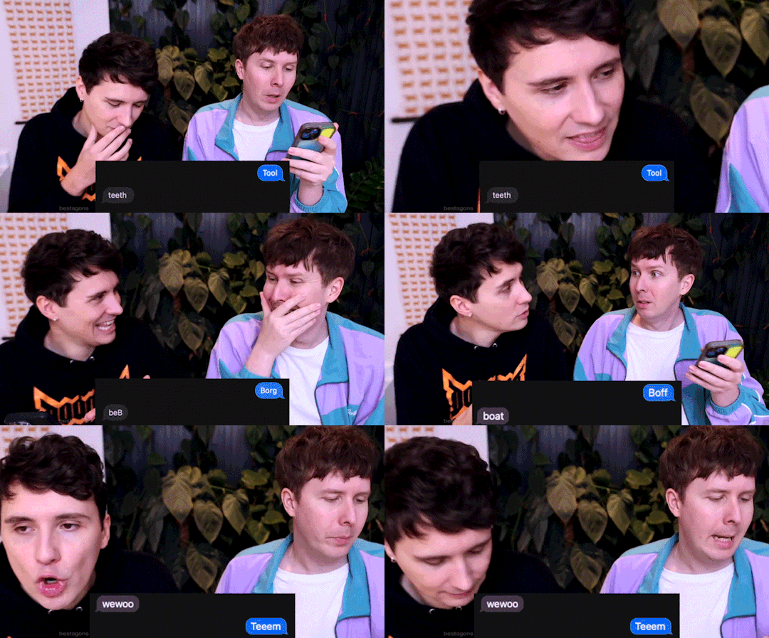

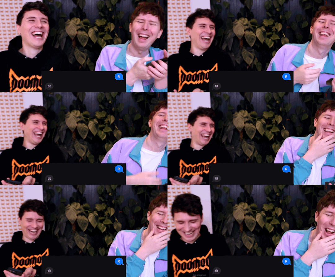
What Dan and Phil Text Each Other 4 + Familect (article)
#dan and phil#amazingphil#daniel howell#danisnotonfire#phil lester#this idea has been cooking in my brain for literally MONTHS but this weekend was literally the first day off i've had since JANUARY#which is so cruel and unusual don't get me started but anyways#and also the first time they haven't dropped something unhinged that i felt compelled to run through photoshop#also it took forever because originally i was going to do all the WDAPTEOs so like i pulled clips from 2 3 and 4#and didn't end up using any of the ones i pulled from 2 and 3 so guess i just wasted some time there#so it didn't take me actually as long to put together the actual set but like i spent a solid 5 hours working on the general project#tbf though the videos are 20 minutes long so like an hour was just watching to get the time stamps#and i didnt want to miss one by putting it on higher playback speed bc some of them are really quick#well congrats if you made it this far in my fucking tags essay about this post#this is like a 'stick around after the episode for a look behind the scenes' segment#hexagifs
290 notes
·
View notes
Text
Dreamer (2024 ver.)

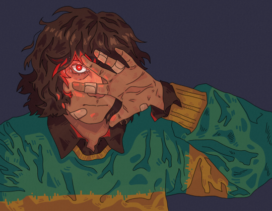
2021 Original below

Bonus:
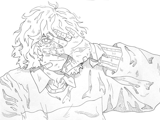

#kris dreemurr#kris deltarune#deltarune#dr#deltarune fanart#utdr#HIIIII HELLO#uhm! it's been! a very long time since i've posted art!#somebody found the original art from i think june 2021 and i thought it still looked good so i decided to redraw it#as you can see i've completely forgotten how to use the tag function on this webbed site so i'm going to retreat into my cave now#if this does well maybe i'll post another art sometime within the next 3 years#drawign#my art#described#id in alt text#eye contact#tw eye contact
219 notes
·
View notes
Text


a small selection of choice bills
311 notes
·
View notes
Text
The new Tommy photo
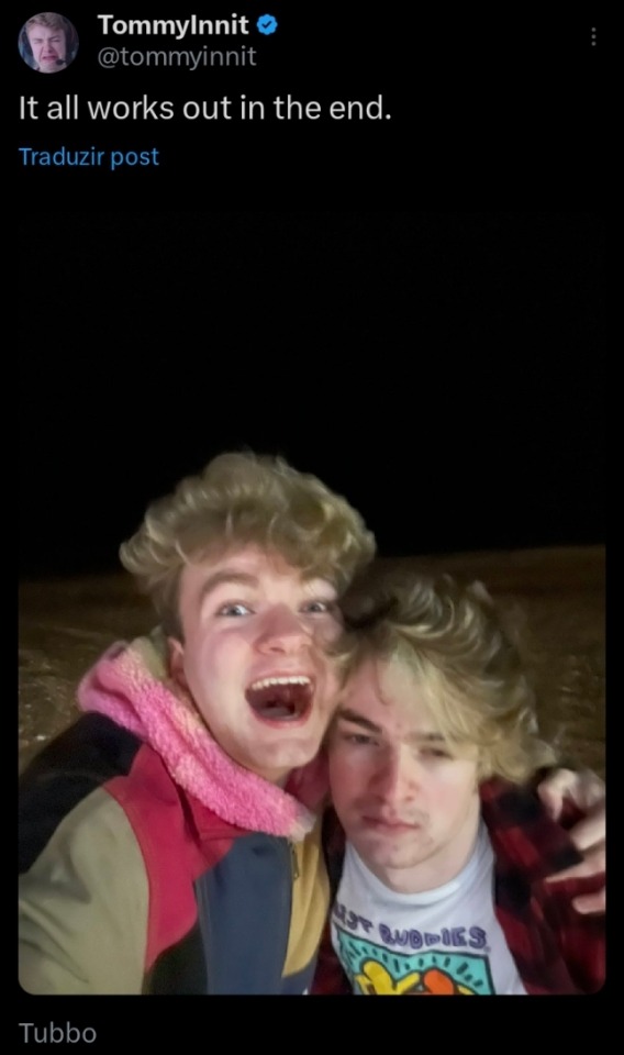
Is the opposite of this
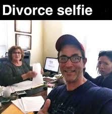
672 notes
·
View notes
Text
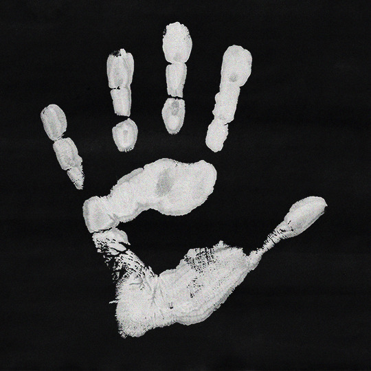

September 18, 2008
#destieledit#deancasedit#spnedit#supernaturaledit#destiel#deancas#supernatural#deancas mine#spn mine#my edit#my typog#my stuff#it's been so long since i last posted something here that i had to check what tags i used lmaoo#and also the photo post editor is different agdsfgh
835 notes
·
View notes
Text
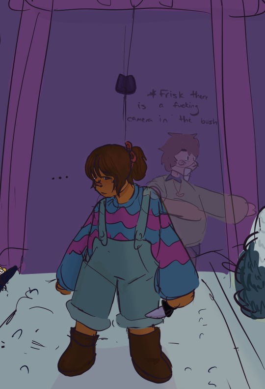
You can never go back.
ID and “challenge” under the cut. ID is also in alt text.
[ID: Digital drawing of Frisk outside the door to the Ruins. Their hair is tied in an uneven ponytail with the Faded Ribbon and they hold the Toy Knife in their left hand. Their face is downcast. Text near their face says “…”. Behind them, a semi-transparent Chara has one hand on Frisk’s shoulder and the other pointing at a bush. Its jaw is cartoonishly dropped and its eyes have minimal detail. Text above Chara’s head reads, “* Frisk there is a fucking camera in the bush.” Flowey is also present, but he is mostly obscured. end ID]
challenge: can you find the flower?!?!
i hope this piece captured the spirit of the undertale
#frisk#undertale#chara#flowey#drawing anonymously#frisk undertale#flowey the flower#chara undertale#flowey undertale#chara dreemurr#flowey dreemurr#frisk dreemurr#dreemurr siblings#undertale fanart#utdr#the ruins#snowdin#safeutdr#safe utdr#its been so long since i last used these tags…#undertale art#undertale frisk#undertale chara#undertale flowey#if you’ve made it this far… please like and reblog and subscribe to Mettaton!
455 notes
·
View notes
Text

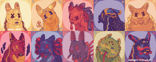
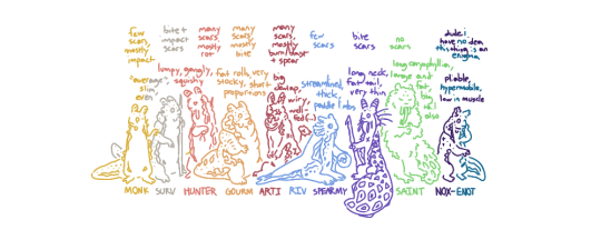
[Start ID. A redraw of the official icons of the ten named slugcats from Rain World, arranged in two rows: Survivor, Monk, Hunter, Nightcat, and Gourmand in the first, Artificer, Rivulet, Spearmaster, Saint and Enot/Inv in the second. Each is drawn in roughly the same pose as in the original art and fitted with speculative interpretations of their biology, and the second image is a “dead” version of this. For example, all ten have slug-like rhinophores in place of ears, cuttlefish-like colorful eyes with strangely-shaped pupils, cephalopod-like beak "teeth", expressive barbels or oral tentacles at the corners of mouths, spiny radulas, and the frilly mantle fringes of sea slugs, though otherwise their faces are squishy, simple and mammalian-shaped.
Cream-colored Survivor and yellow Monk both share triangular, bicolored spots matching their eyes (which are tan and brown, and two shades of blue, respectively), small, bumpy fringes, and relatively neutral looks on their faces. Defensive-looking Hunter is mostly a dull orange-pink, though their blobby fringe is a more violent red and their back is purple and marred with lumps. Nightcat is navy blue and flecked with dots of yellow and teal, their rolled rhinophores are a lighter blue, and their shading fractures into stars in some places. Gourmand is almost uniformly tan, their wide, very ruffly white mantle fringe bordered by a spray of white spots, and their beak sticks out from either corner of their smile. Primarily red Artificer, snarling, has yellow markings of multiple sorts, a prominent yellow dewlap and their characteristic dark scar taking out a chunk of its face. Rivulet is a darker blue than usual, with long barbels, red gills and rings, countershading, and a cheerful expression, sticking out their radula. Spearmaster is purple with orange accents, eyes and spots, a large fringe and spines down their back. Saint’s green caryophyllidia are marked by small, yellow diamonds, and their long, thin radula extends far below them. Enot is decorated with mottled red stripes, blue patches, yellow stars, and an uneven and almost cartoonish imitation of blush, though generally the same deep blue as Nightcat, a passive or almost slightly smug look on their face and their rolled rhinophores out to either side.
In the second image, nine of the slugcats’ eyes are crossed out, indicating that these are death icons. They look fairly the same, with mostly expression differences. Survivor is caught in the beginning of a threat display, a karma flower sprouts from Monk’s side, Hunter is burdened with overgrowing, purple and blue rot, Nightcat’s rhinophores are pinned back, and Gourmand looks mildly disheartened. For the final row, Artificer bites its radula between small plumes of smoke, Rivulet drops their expression, Spearmaster looks very startled, Saint looks almost entirely the same besides half-open eyes and their markings greater in number, and Enot grins confusedly. End ID]
If you'll excuse the unusually lengthy ID: the arena meme introduced by @pansear-doodles at long last after a nearly year-long wip status (or, rather, finished a month ago today to honor my own first time playing it!)
Design notes and shout-outs under cut! :]
The following people are some of those who’ve inspired my designs most since I started this eight months ago (or just inspired me to get a little weirder with slugcat biology), among many others for sure, and I thank them for it–but this is simply to bring attention to artists I find cool, and in no way an obligation to interact or anything :]
> @saturncoyote , @carpsoup , @charseraph , @gallusgalluss , @bitsbug , @dopscratch , and @0hmanit (and a special mention to dddeerbo and hunterlonglegs, who’ve since deactivated)!
Survivor: Surprisingly the hardest to pin down the colors for, since nothing with its sibling's palette seemed to match up right (I did have to add in a little blue somewhere for Monk, the beginning of making it clear how much I’m simply going based off of vibes for the colors of scug innards). I consider them, Monk and Gourmand to be part of the same gene pool of slugcats, and even possibly the same colony even if the latter isn't really related, so took a bit of Gourmand's coloring and fit them in with their inspiration: Goniobranchus verrieri. They serve as a bit of an introduction to my ideas of scug traits (i find it really fun how many people have thought to add so many silly sluglike fixtures of biology completely independent of me, buuut here I’m mostly talking about species variation), and like in-game they’re pretty average! They, Monk and Hunter have a couple scars sourced from a piece of Joar's concept art that I'm failing to find, those across the bridge of the nose, under the eyes, and across the rhinophores, respectively, and my Survivor interpretation features many on the back of the neck, as a result of survived lizard bites.
Monk: Their coloring is primarily based off the fact that I associate them with blue fruits, honestly, a bit because I was compelled to establish a familiarity with Rivulet, and lastly inspired by the spots of Goniobranchus kuniei (and geminus, less important to me as one of my characters is a kuniei instead, but more fitting). Between the yellow + blue and the circular marking in the center of their face, they’re meant to bear a little resemblance to an iterator that shares similarities with the characterization I’ve given them, and similar coding of her sibling can be seen on Survivor’s markings around the eyes. As both a “default” slugcat and one whose campaign I haven’t played, though, I can’t say I have much more to point out about em.
Hunter: The whole rot thing made for a really fun time drawing them, and while the color change on their back is a result of this, it’s also an excuse to relate them to Babakina festiva, arguably my favorite sea slug (mostly for sentimental purposes). And to Spearmaster, a fellow messenger slugcat, and it serves as a gradient between Hunter’s pink and the “traditional” color of Rot seen in the DLLs. Aside from their affliction, they’d actually be the plainest in terms of design, as they don’t have any patterns or quirks of body type, just the red + purple and strange lumps + possible malnutrition. I can’t remember if NSH had created them in particular or just...caught + released or something, but it probably wouldn’t be strange for a lab-grown slugcat to be simple like that.
Gourmand: Like the two above, they’re rather plain in terms of coloring and adaptation, and like the two above, I find that fun. I decided it would be nice to avert the “all slugcats being of the same body type, and Gourmand’s out of place as the exception” thing by just...adding more fat to all of them, really. I did want to emphasize their sheer bulk even so, both fat and muscular (not like I couldn’t have still gone further with it, of course, but slugcat anatomy can be a little obfuscating sometimes, and they were intended to look rather plush considering personal size headcanons and therefore the lack of proper gravity), and the thick and flounced mantle looked like a good addition, as per their sea slug Glossodoris hikuerensis. Unlike Survivor and Monk, I didn’t attempt to hold their resemblance to any particular other character (which means a little less to balance out the “default gene pool” thing), so those are all the design notes I have for em.
Artificer: The second slugcat I’ve ever played, or finished the campaign of, my favorite for at least a long time, and the first thing I did was give them yellow accents, the shape of which have troubled me slightly (not quite like the spots or stripes of the others). They’re both a little more appealing and more explosive-looking to me, and considering how early on I played Arti, actually present in some of my older art. It does give them a little resemblance to Saint (completely intentional, two slugcats with strange relations to karma), as well as the fact that its radula is green for familiarity with one of its children (at some point it was going to have all-green markings, even!). I’m generous with their scars, partly because it was fun to overemphasize the one on their face and partly because it does seem like a reckless slugcat, on top of the dangers of its explosive abilities–I’ll probably just keep adding more forever. Mostly-red sea slugs aren’t too common, but Hexabranchus sanguineus works for sure. The ridged, yellow dewlap can expand for combustion purposes, or something along those lines. Arti’s where I began experimenting with a lot of the mildly-offkilter features seen in my interpretation of slugcats, as they’ve once again been a favorite from the start.
Rivulet: I've obviously given other slugcats spots, deeply enjoy the bubbly-soda markings of other peoples' slugcats, and thought seal riv would be cute. Despite not too closely resembling it, they've been government-assigned Hypselodoris bennetti, for color reasons and for a couple sentimental ones. Originally, the colors of every scug were meant to match up with the custom colors I gave them at the beginning of their campaigns, (though Arti, Gourm and Spearmy are the only three who actually apply here, since I've only played through half the slugcats: I gave arti the yellow as mentioned above, gourm brown eyes and spearmy light pink spears, furthered by the outskirts pearl accompanying me and that palette all the way to moon. Tolerance training for eternity in hell cause I already knew about the maroon pearl quest). I initially gave them the colors of the bi flag for fun... but with the limited palette of this image, I was left without pink for a while and decided to see how they'd look in red. I then realized how they now wonderfully matched Moon, and besides, red's a sort of camouflage in deep water! As a side-note, the difference between their eyes and those of others always bothered me a little for anatomical purposes, and the cephalopod eyes were probably influenced by this!
Spearmaster: Inspired as much as possible by @notyourfunnyman ’s wonderful spearmy: designed in a way that helps it fit in with scavengers, at least between the long sensory tentacles, big ruff, back spines and slightly thin/distended anatomy, a form of defensive mimicry. I always had annulate rhinophores in mind, for a little diversity sure, but mostly because the shape reminds me of radio antennae and communication towers (seems fitting for the comms array and being a messenger slugcat)! I started searching for a real-life slug to give them just by looking up their rhinophore shape...and was met immediately and coincidentally with annulate-topped nudibranchs that fit them more perfectly than I could've imagined: Flabellina and surrounding clades, I think Paraflabellina ischitana works very nicely. The orange was completely unplanned, but there wasn’t a place for light pink among the other slugcats’ palettes, and importantly it likens them to both Hunter and Seven Red Suns a little more.
Saint: I am very much a non-furred slugcat enjoyer, with respect to those who aren’t, so figuring out the only visibly furred slugcat was an interesting challenge. I’ve decided that they likely have other, milder adaptations for help in the cold, mainly just more efficient fat storage, and what looks vaguely like fur is instead a bunch of tubercles (called caryophillia, for the second reminder out of three). Their inspiration doesn’t have these, however, Miamira sinuata’s numerous yellow and blue spots (not to mention...whatever’s going on with that shape) and general effect of being the only really green nudibranch I could find were probably perfect for a strange green echo. Not pictured, but their beak-teeth are tiny and flat to make a surface for grinding soft food against with the lack of a functioning radula, which is tipped with a specialized spiny “grapple-hook” for better traction/grip (not to mention the numerous little teeth running down the whole thing).
(Best part of hiding this under a readmore means edits will be seen by all reblogs, I'm mostly sure, because I completely forgot to mention! The spots on their forehead are simple eyes. Their camera eyes appear closed in-game, I like to believe their complex eyesight is rather poor anyways or otherwise reason that they aren't seeing out of those, and while this was far from her REASON for attunement with the world, it does help compensate for mainly viewing it through a canvas of simple light and dark. This, and the fact that their swapped-out "fur" is not only to commit to a lack of hairs but contributes to sensory input!)
Nightcat/Enot: I guess you could say I found the “these two are technically the same person” compelling. (E.g. similar colors, both very strange and enigmatic, and Enot/Inv/Sofanthiel’s remark during the dating sim about getting removed from Arena Mode.) I doubt they’re the only two slugcats in their body, considering humans with DID tend to have more than a few (and I find it very funny that a slugcat bearing resemblance to Nightcat appears in Gourmand’s ending. They’re allowed in the colony and Enot isn’t </3), and I have to credit @faelingdraws ’s art for being what convinced me on it! Their design inspirations come down to trying to balance a few different ideas: making the patterns and palettes of both look oddly similar (special mention to the stars, since those are fun to draw), basing them off of Felimare sechurana and juliae respectively, using blocks of color with the same placement as in Enot’s official art, and specifically making Enot look...biologically reasonable and imperfect, whilst also clearly trying to imitate human displays of emotion (what with...the eyes and blush on that one piece of official art).
Lastly, here’s just a lineup with notes on body shape and size. Most of the nicknames (existing to give a little more space, that’s all) are obvious, and while I can’t remember why I shortened Nightcat to Nox, it is in honor of my friend by the same nickname :]
#survivor rain world#monk rain world#hunter rain world#nightcat rain world#gourmand rain world#artificer rain world#rivulet rain world#spearmaster rain world#saint rain world#enot rain world#slugcat rain world#rain world#peridots-art#< feels like too long since that last tag's been used. i can say with certainty that the majority of the reason i haven't been just as#active here (not to mention not drawing as often since that's relevant) is just due to my life getting busier with a new school year but i#do miss putting my stuff here! and would like to reblog more on top of that.... so forgive not remembering exactly how to tag everything#(and how to write everything up there but to be fair it's not like long textposts were a staple of mine. i mostly just rambled and it was#fun hehehe.....some of those notes (parts of riv/spears mostly) were written around the beginning of the drawing itself)#OH i messed something up with the drafting and really did not mean to post it while tags were in progress! but regardless. i would've liked#to post it tomorrow to mirror how i was going to post it on JAN 29 a month ago......but it's not like i'm unhappy with this outcome :]#to sum it up really though it's been strange working on this for so long.....unfortunate to not get a chance to let it be seen and keep#experimenting with odd biology much earlier but i'm just glad it's out now cause i am proud of these!! it's been a lot of fun and slugcats#are still my go-to doodles :] if i had to end this off promptly though what's up with that secret pipeyard shelter as gourm that's not on#the maps. connected to vs_a04. doesn't appear on the miraheze or interactive maps for anyone strangely but i've only been there as gourmand#anyway! i'm sure there's a lot i could've said in the rush but goodbye dear reader anyway :]#i forgot spearmy initially. i'm so sorry
343 notes
·
View notes
Text
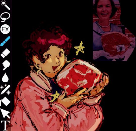

been missing this series so i doodled my favs idk
#i just changed my url again to rebrand myself but hi<3#i improved my art throughout this time i think tho i have not drawn these characters in a WHILEEE#im prolly turning this blog into a sideblog dedicated to su lolz#steven universe#su#steven quartz universe#steven su#su steven#rose quartz#pink diamond#rose quartz su#pink diamond su#fanart#steven universe future#suf#its been SO long since i posted anything abt this series i forgot which tags to use uhm#my art#frilled art#<- new art tag btw :)#why is steven holding a piece of meat? thats for me to (not) know and for you to wonder
99 notes
·
View notes
Text
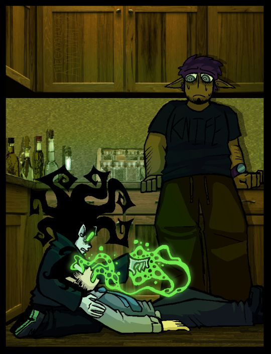
so REVENGE, HUH? or justice, if that makes you feel better. it tastes the same when cooked just right. 'I REALLY WANTED A BROTHER.' such a shame to burn a bridge you so desperately wanted to keep, especially when it wasnt even you who started the fire. especially when you hope that not a single fragment of that bridge ever washes ashore.[MAY IT ROT FAR FROM MY SIGHTS] an unfortunate loss! atleast he has his friends.
#jrwi fanart#jrwi show#jrwi prime defenders#jrwi prime defenders spoilers#jrwi pd spoilers#jrwi pd#william wisp#vyncent sol#THIS ONE IS FUUUUCKIN OOOOOLLDD RAAAHHHHH i made it like. a year ago. but didnt finish it for so so long bc i just wasnt happy w it.#BUT LIKE A CENTURY EGG the decades of being encased in salt n lime n ash have done WELL to bring out the flavores of this piece#i sorta recently cleaned it up and posted it onto twitty. didnt tag it bc it was SO OLD AND SCUFFED(i see so many MISTAKES NOW)#that i didnt want to expose it to the open air just like that#if i show smth to my small circles then it shall only be understood in those small circles.#open air and open interpretation from minds i cannot predict are NOT something i enjoy the thought of. usually. i am brave tho#BUT EVERYONE ON TWITTY WAS SO NICEEE i was like damn... i guess it IS good enough to be enjoyed by the masses...#lets work on being nicer to our art together. THAT BEING SAID. i really love my colors here HELL YEAHHHH#FIRST TIME IN A WHILE COLORIN THESE BOYS.... i dont use proper color enough..I ALSO RLY LIKE MY BACKGROUNDS HERE#i LOVE when the bg is hyperrealistic (i frankestiened stock photos) and when the subjects are all flat colored n cartoony#recently rewatched Making Fiends and they do that similar thing!! soft shading! lotsa details! almost painted? ill paint one day#ive already rambled so much abt the art im runnin out of ROOm to ramble about WWWIILLIAM GODDAMN WWIIIISP. its been a minute since i saw-#-this episode..but i DO remember the funny smoke trick that will did to his funny brother. EVERYTIME U GIVE AN ORDER. THAT BRINGS HARM-#-INDIRECTLY OR NOT. YOU WILL HEAR THOSE SCREAMS. YOU WILL FEEL THAT PAIN. OHHH WHAT A COOL PUNISHMENT THAT IS#its still an olive branch in a sense! a final chance for big bro bell to show that hes NOT an irrideemable piece o shit. and if not#well. to the wolves of psychosis with him!!! i really think william did the best he could here. if i was in his shoes i have no doubt i-#-woulda done the same. IM ALSO GLAD THAT VYN DECIDED TO STICK AROUND N SUPPORT HIM! thas character development baybe!!#i loooove prime defenders.. its been so long since i watched any eps of it but i KNOW it still has such a grip on my heart..GOTTA rewatch i
323 notes
·
View notes